Aegle help users book a doctor’s appointment on their mobile phones or their computers without going to the hospital with the aid of video call, voice call, chat and home visit with the doctors.
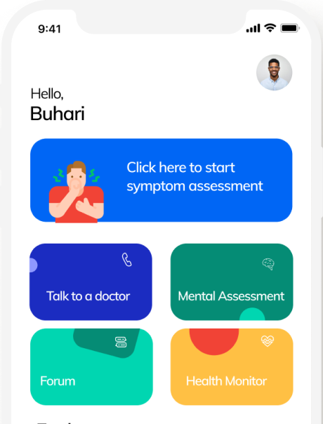
Teamgrace Health gave me a task to imagine a better way to talk to a doctor through the means of a voice call, video call, chat and home visit and also have access to other medical features like a symptom assessment and medical assessment.
User interface and user experience designer: Designed the Information Architecture, Userflows, Wireframes, HiFidelity prototypes and Design system.
The research was divided into two parts: Primary Research & Secondary Research. The user interviews part of the primary research was taken care of by the Teamgrace Health team in the UK, as they are closer to the users while the secondary research was undertaken by myself
The Teamgrace Health team conducted a nationwide survey of 500 adults living in Nigeria. Interviews were over both landlines and cellphones.
From the interviews conducted, we gathered 3 key reasons from the users on why they self medicate themselves:
- Ease of access through the internet
- Affordability
- Trust
We researched on the Doctor appointment products out there and found out those who seem to be offering the same solution our product will be offering. The aim of this is to pull out useful learnings that could help us build an even better product.
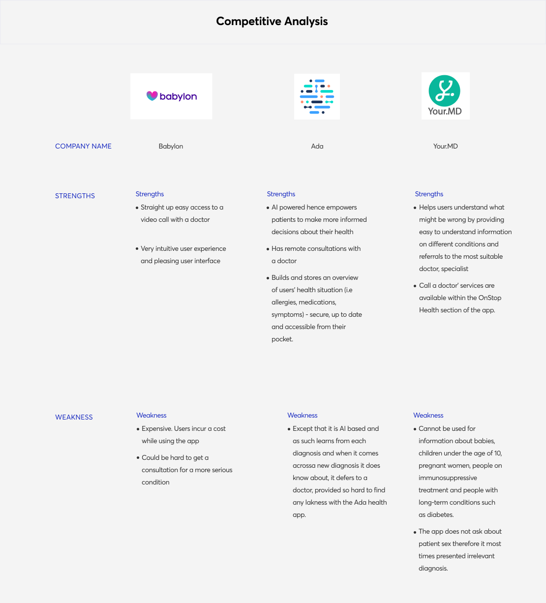
Competitive analysis diagram
Strengthened from these insights above, we began to ideate on solutions to the problem statement. Each individual of the team came up with their own solution to the given problem, out of which assumptions were created. The top three assumptions we made were:
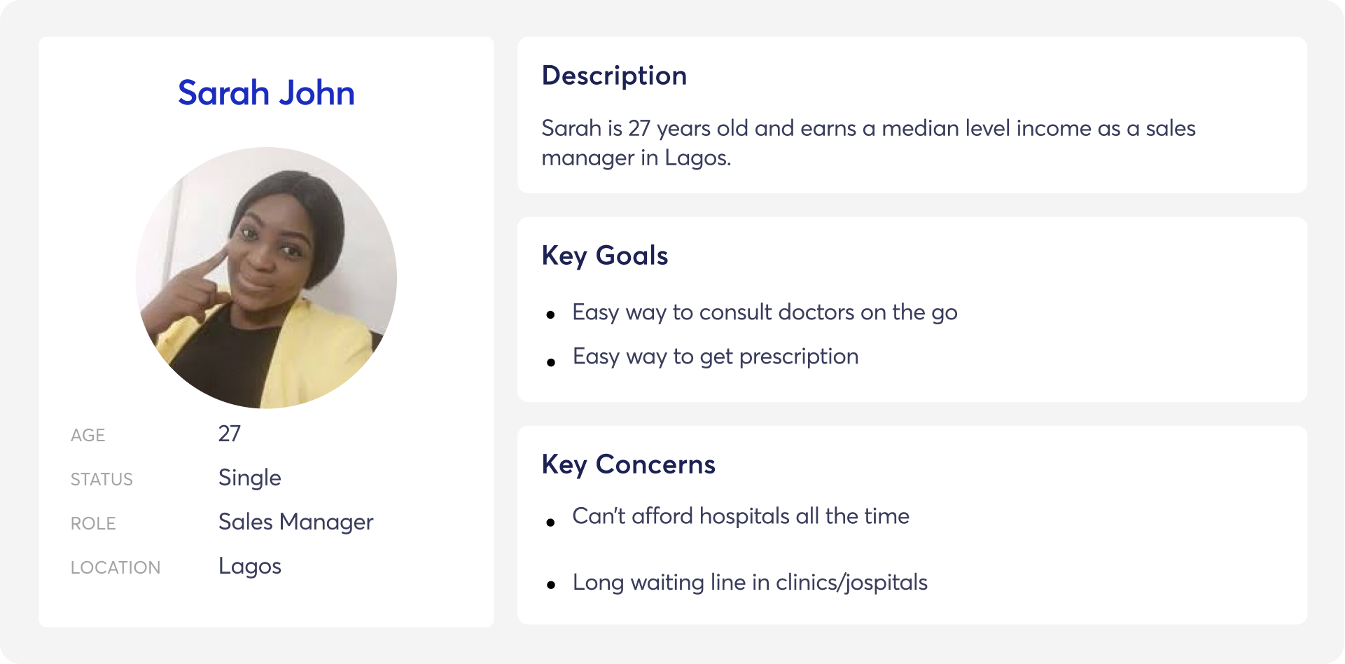
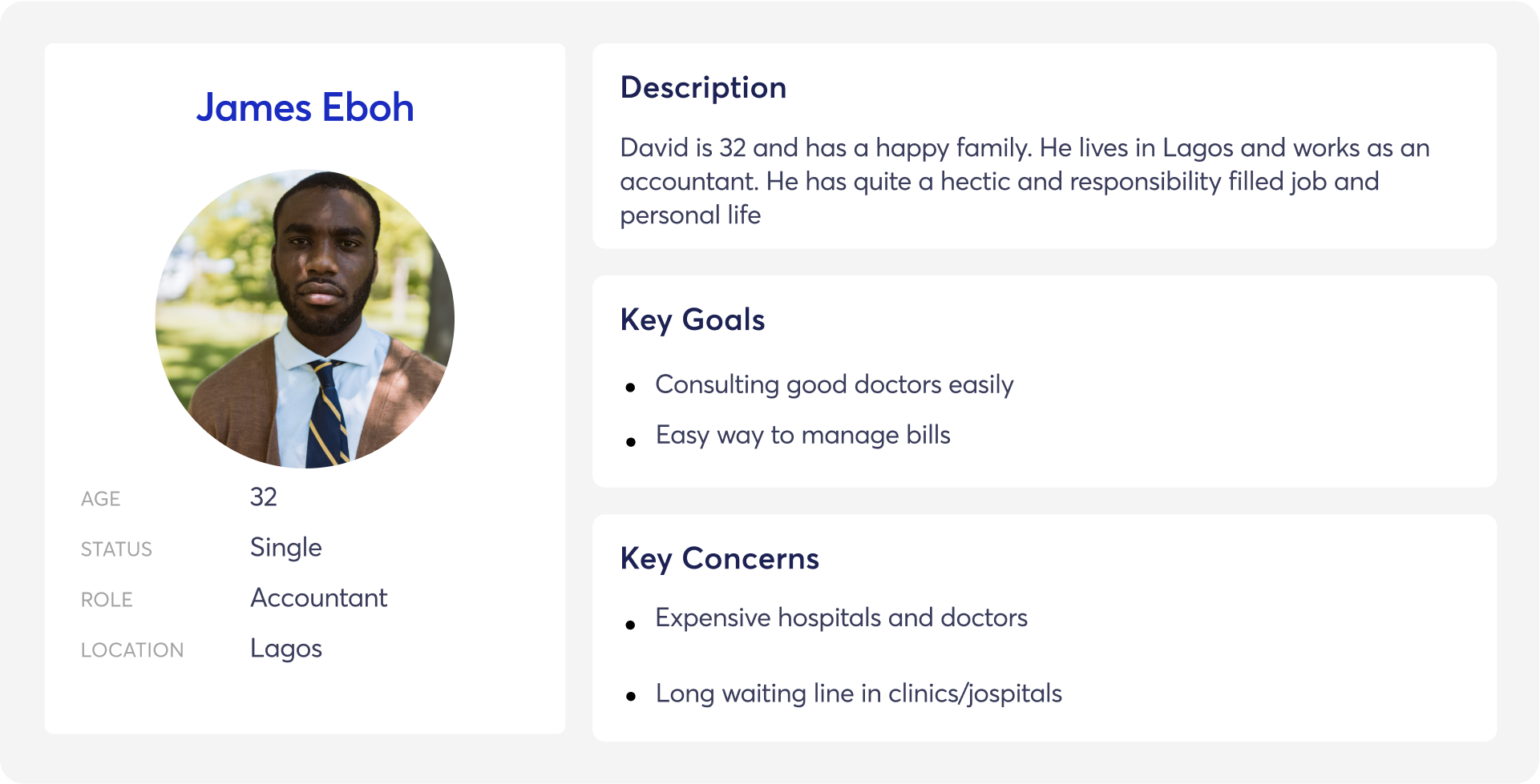
Personas helped us to create memorable, realistic characters that represent a set of our stakeholders, and from our research, we identified two prime user segments. Persona was useful for us a reference during the whole design process to remind each of us the person we designing for.
I used the experience map to help me create a visual representation of the userflows. I then used it to make informed decisions when creating the Journey of the user.
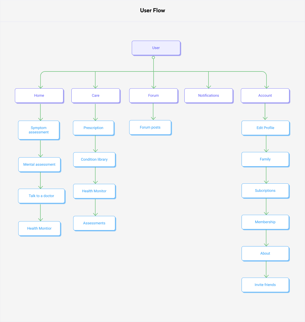
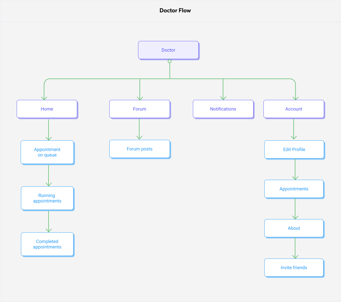
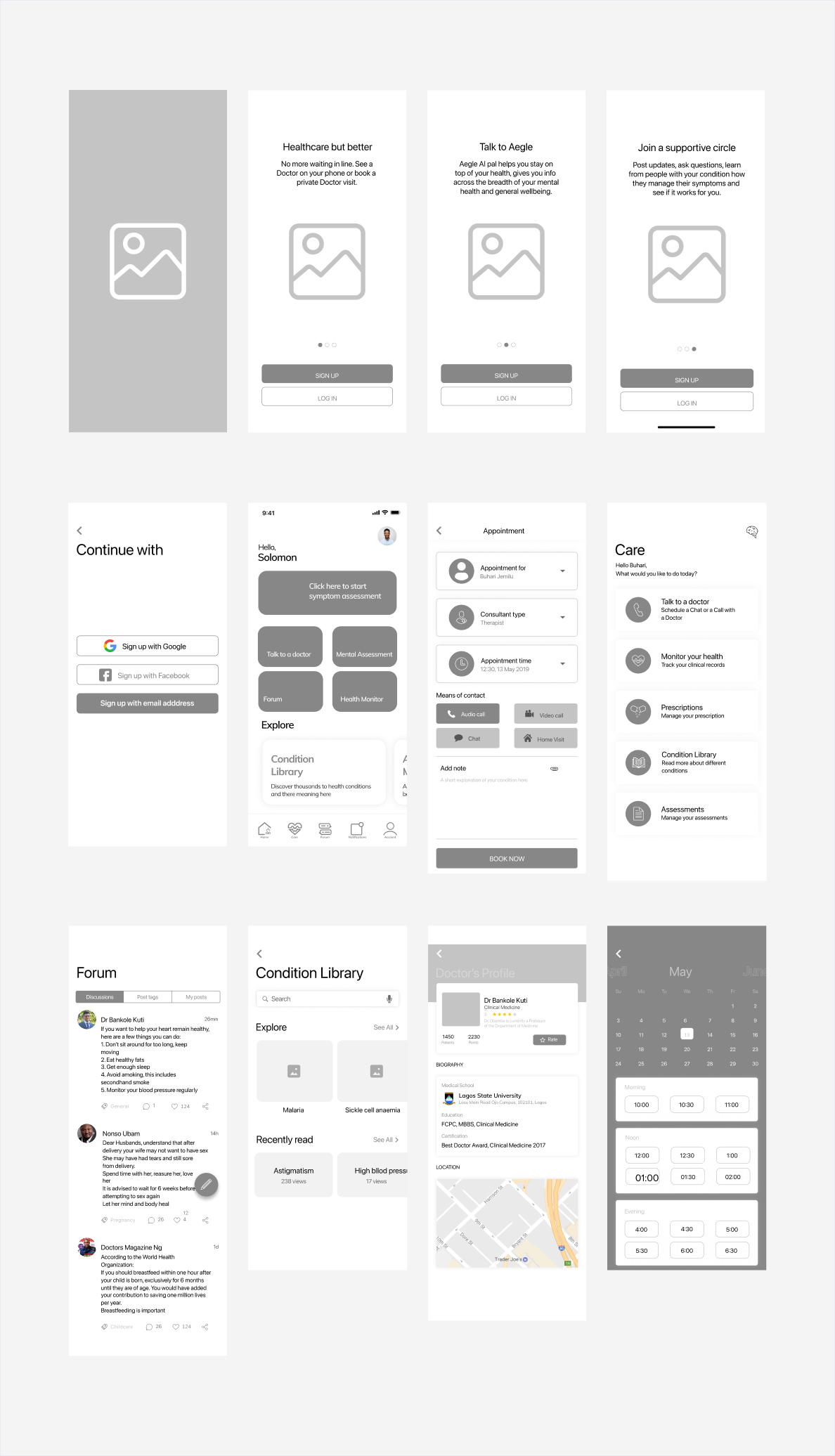
The application map informed the key screens that I developed in the first set of low-fidelity sketches. These became the basis of the prototypes I used for the first round of usability testing. Based on the application map I had designed earlier, the prototype included the key screens needed to allow people to sign up for the first time, create a task, and assign the person responsible.
The UI design stage is one of the most exciting parts of every product design project, and this wasn’t different.
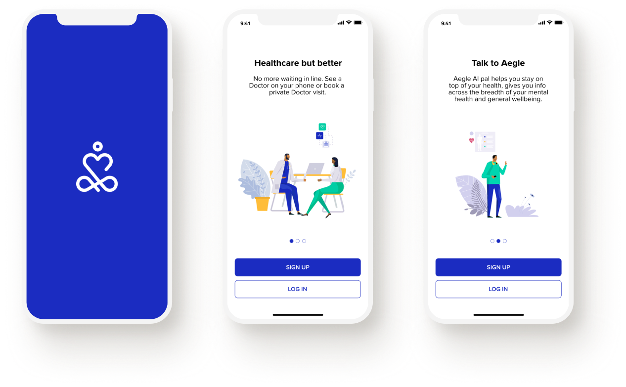
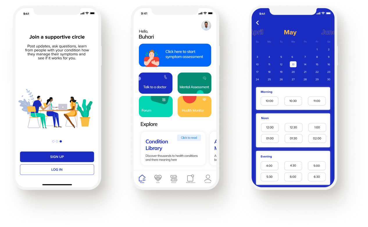
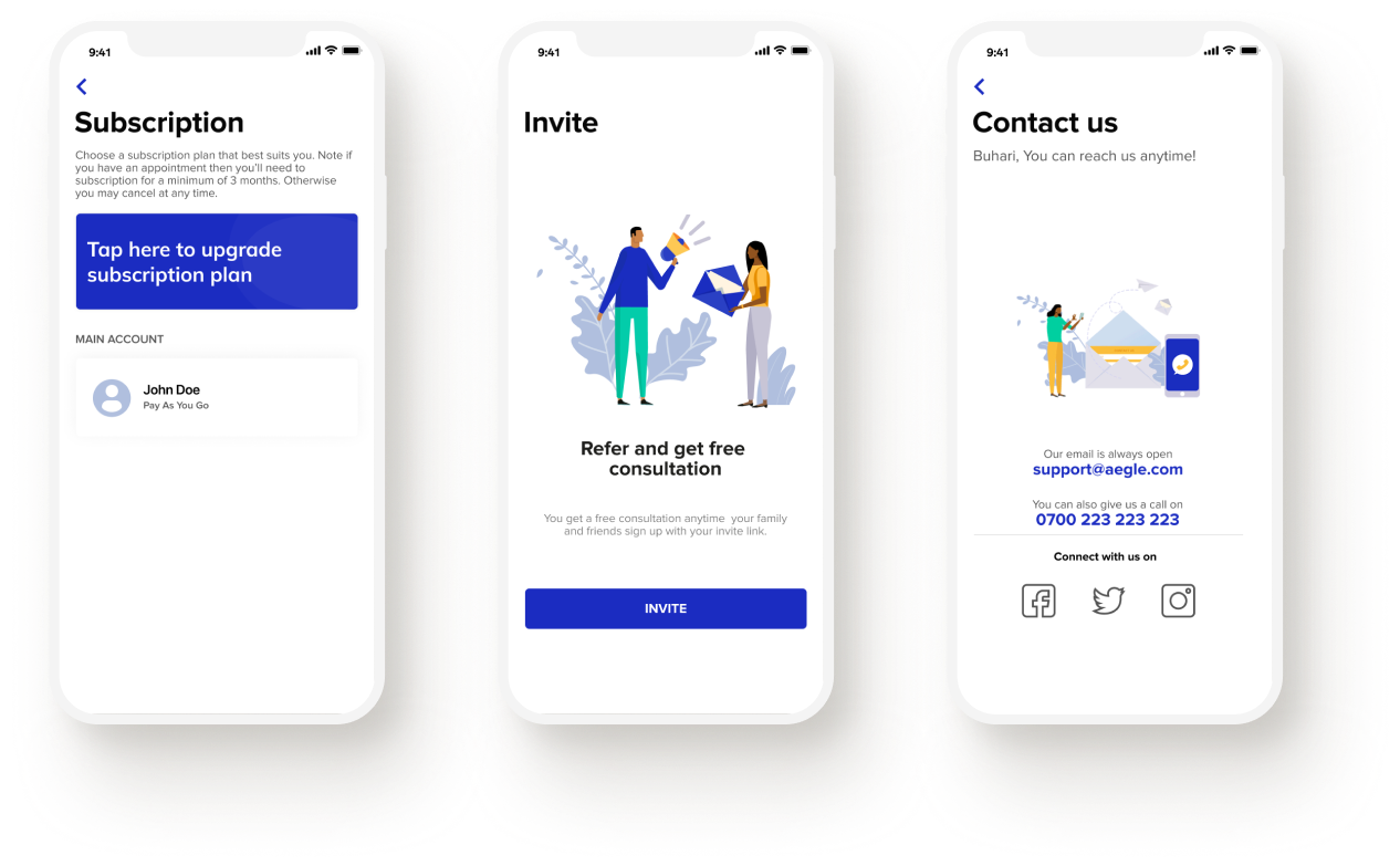
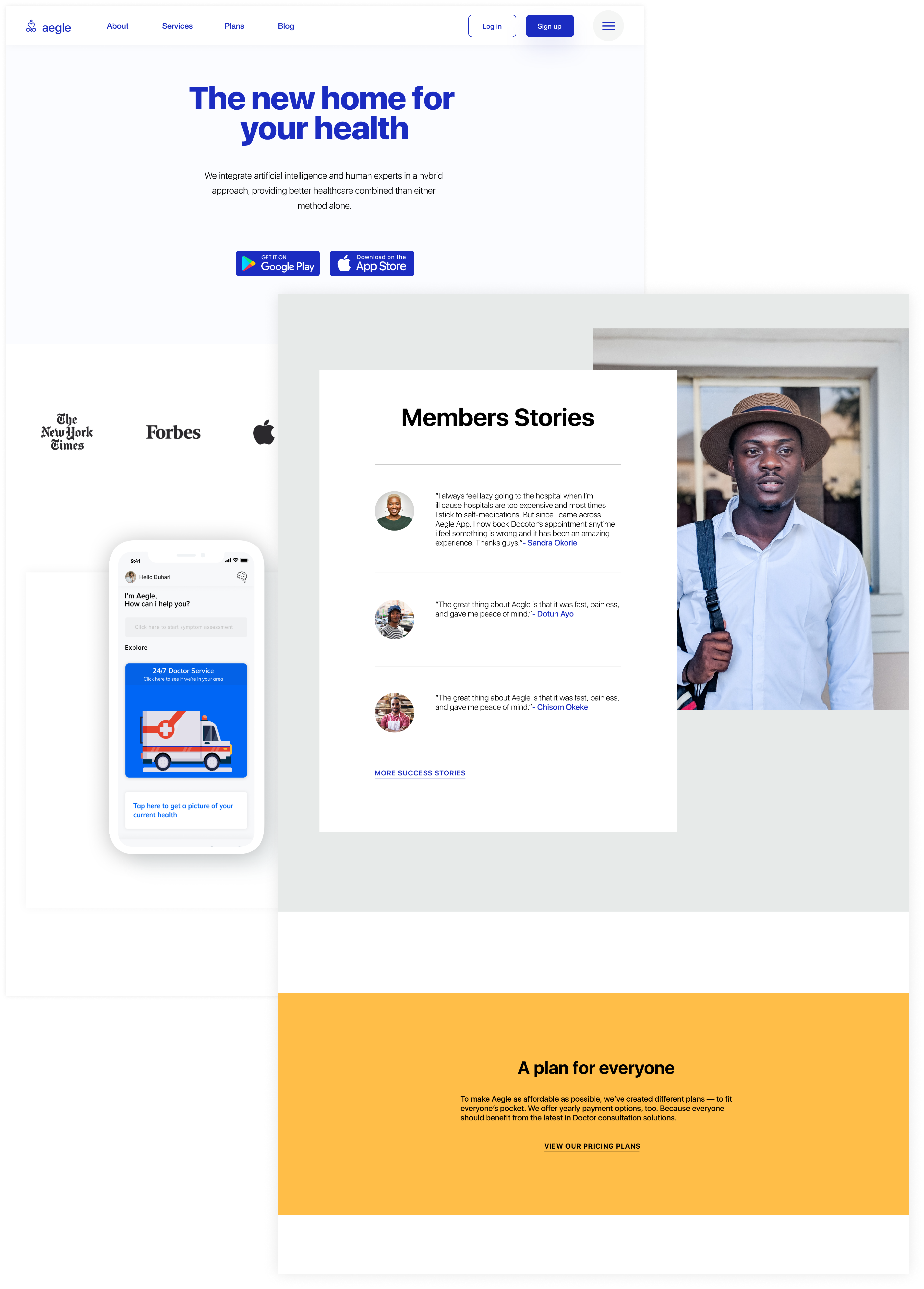
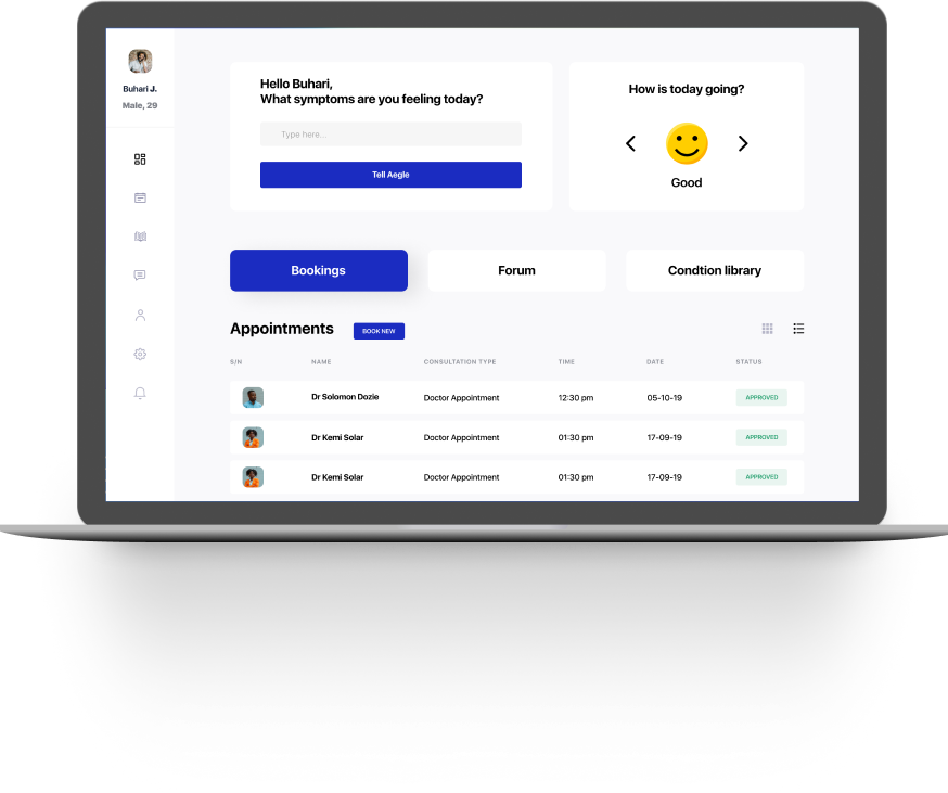
Patient Dashboard
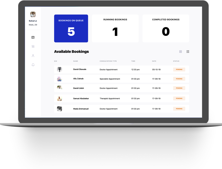
Doctor Dashboard
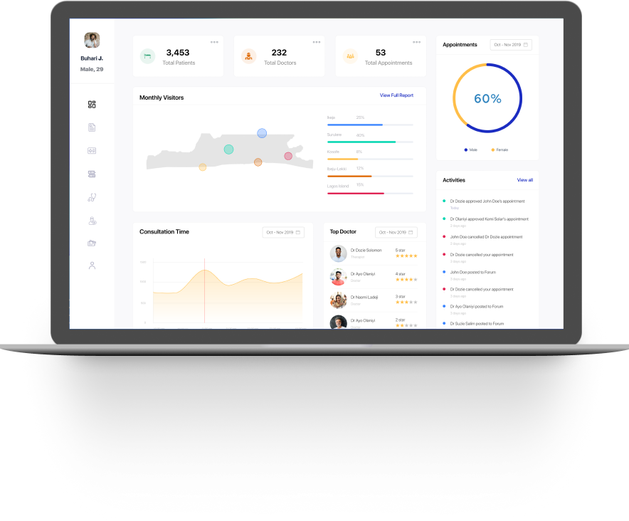
Admin Dashboard
The UX design was achieved based on intuitive navigation patterns, minimal design, synthesize content, prioritize features and a well-planned UI. As a result, Aegle is a stylish and sophisticated software that offers a good range of different features to create an outstanding user experience for the users and the doctors with an elegant and impeccable design.
Send an email
buharijemilu@gmail.com
© buhari-jemilu, All rights reserved
