Reimagining Cross-Border Payments with Changera

Overview

Product: Changera – Borderless Payment & Lifestyle App v2

Role: Head of Design

Team: Product Manager, Engineering Team, Compliance Lead, Support Team

Timeline: 4 monthsTools Used: Figma, FigJam, Notion

Platform: Mobile-first (iOS, Android)

Website: https://changera.co

The Challenge

Changera is a digital platform that allows users in Africa to spend, send, and receive money globally — via virtual dollar cards, crypto wallets, and multi-currency transfers. But as the product scaled, core usability issues emerged:

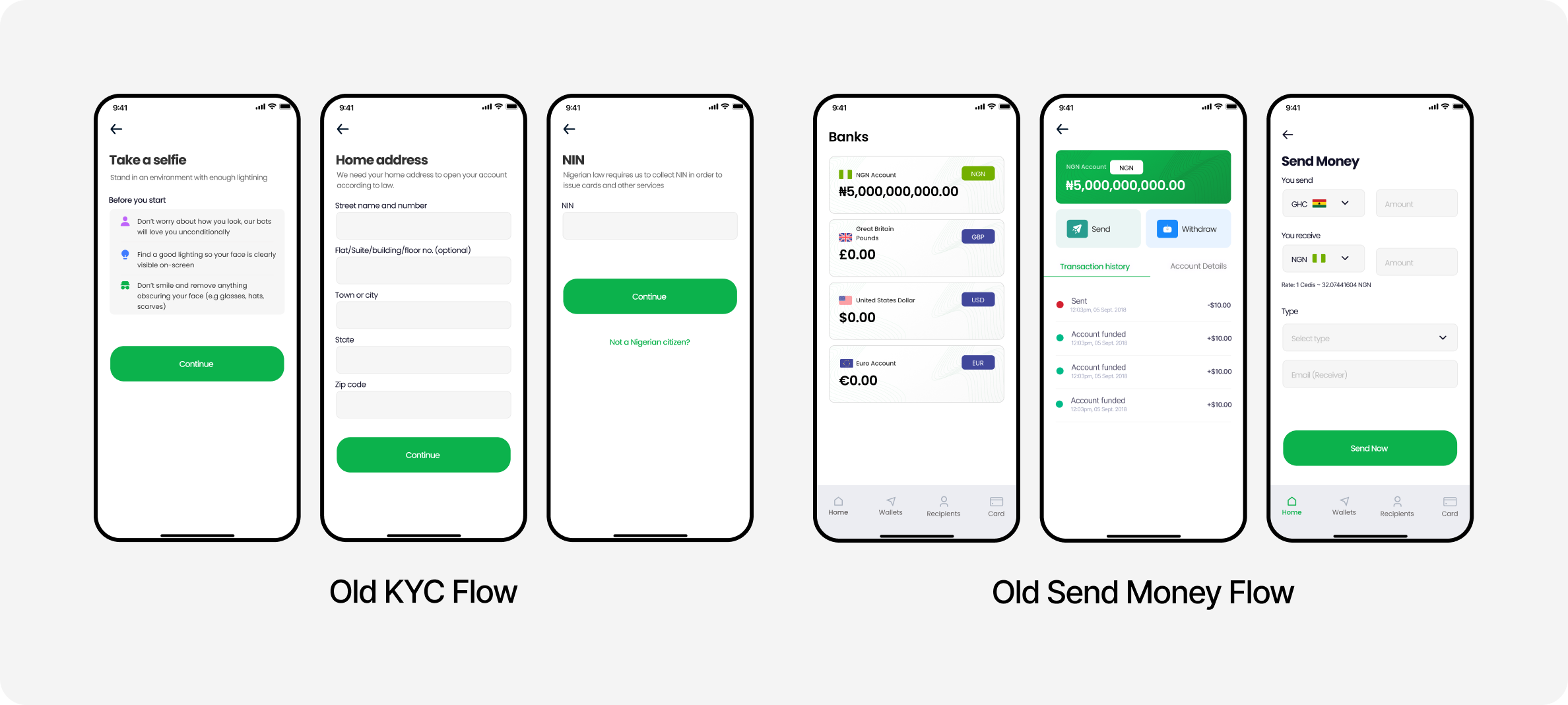
  • Confusing onboarding and KYC flow
  • ack of trust due to unclear FX rates and transaction status
  • Inconsistent UI across screens and features

My goal was to redesign the experience to feel seamless, transparent, and trustworthy — especially for non-technical users navigating cross-border financial tools.

Discovery & Research

Activities:

  • Conducted 1-on-1 user interviews with freelancers, merchants, and diaspora users
  • Ran usability audits on the live product
  • Reviewed user complaints and support tickets
  • Benchmarked platforms like Payoneer, Wise, and Flutterwave

Key Insights:

  • Users wanted clarity: on fees, card limits, and real-time balance.
  • The onboarding flow had too many drop-off points and inconsistent error handling.
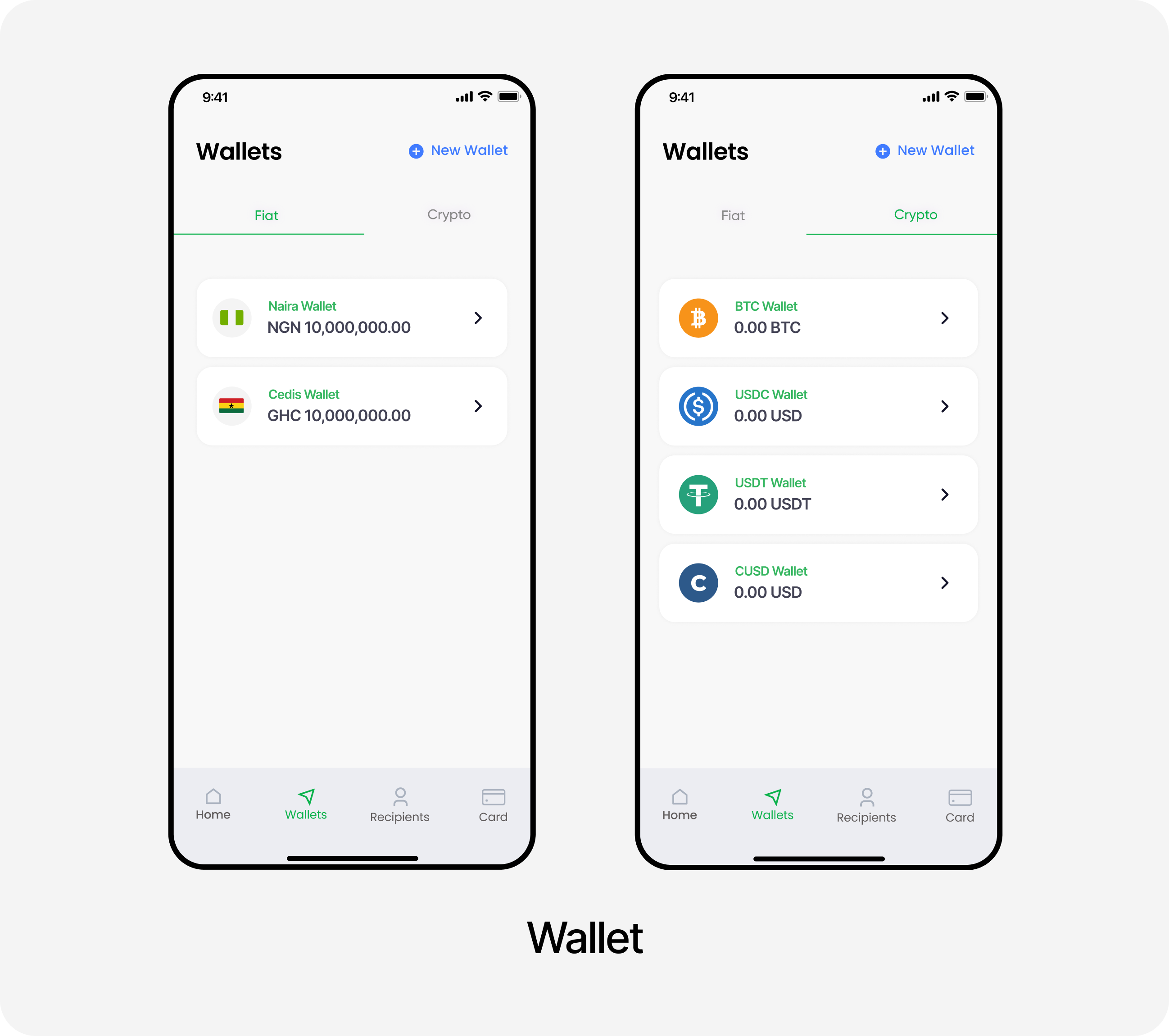
  • Users often confused the crypto wallet with their main Naira or USD wallet.

Problem Statements

  • How might we make wallet management clear and intuitive?
  • How can we reduce onboarding friction while still meeting compliance needs?
  • How can we create a visual system that builds trust and supports feature scalability?

Design Process

1. Information Architecture

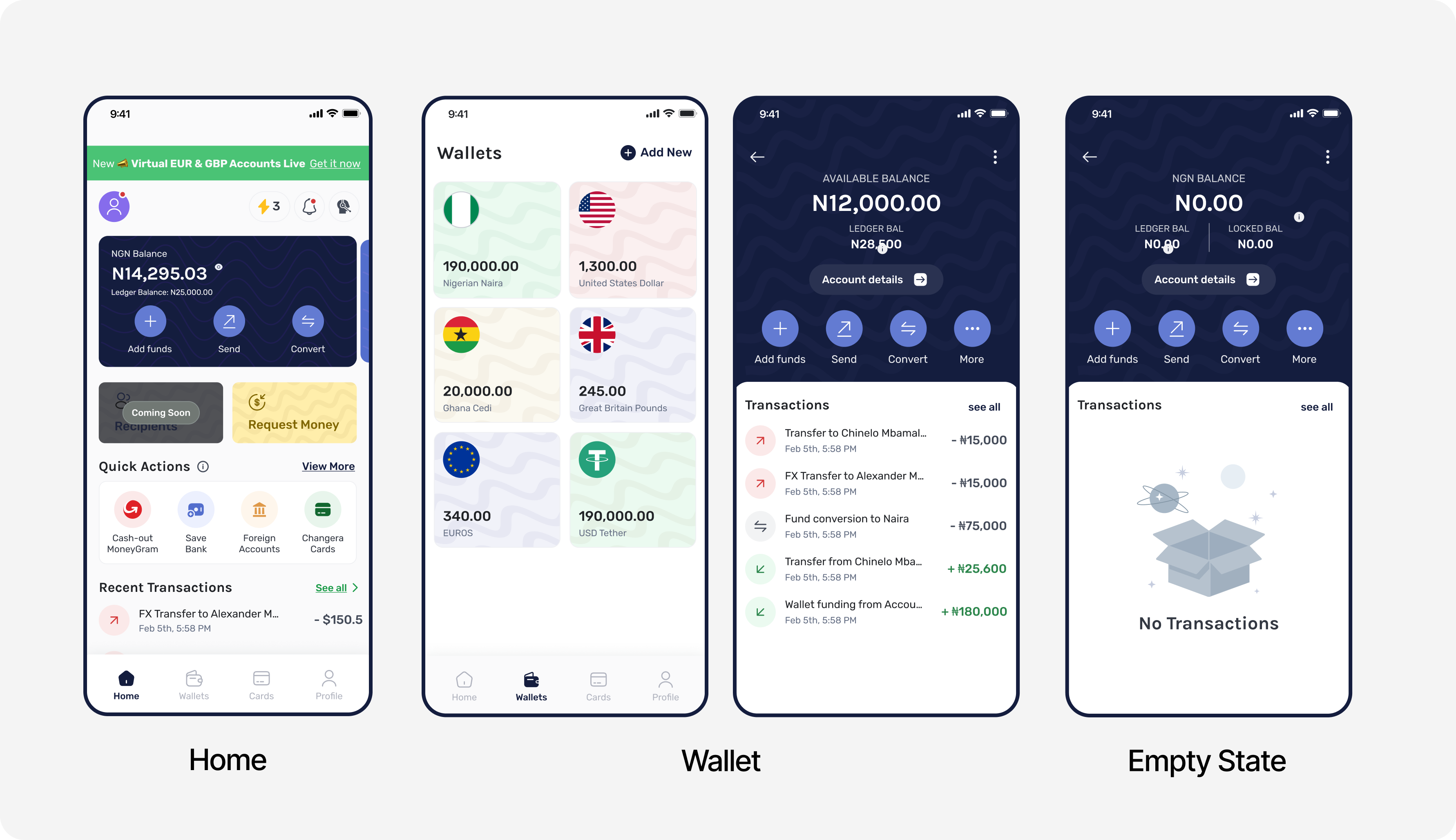
  • Re-organized the app’s navigation around 4 pillars: Home, Wallets, Cards and Profile
  • Grouped features based on user intent instead of technical architecture (e.g., Send placed under "Wallet" not "Virtual Card")

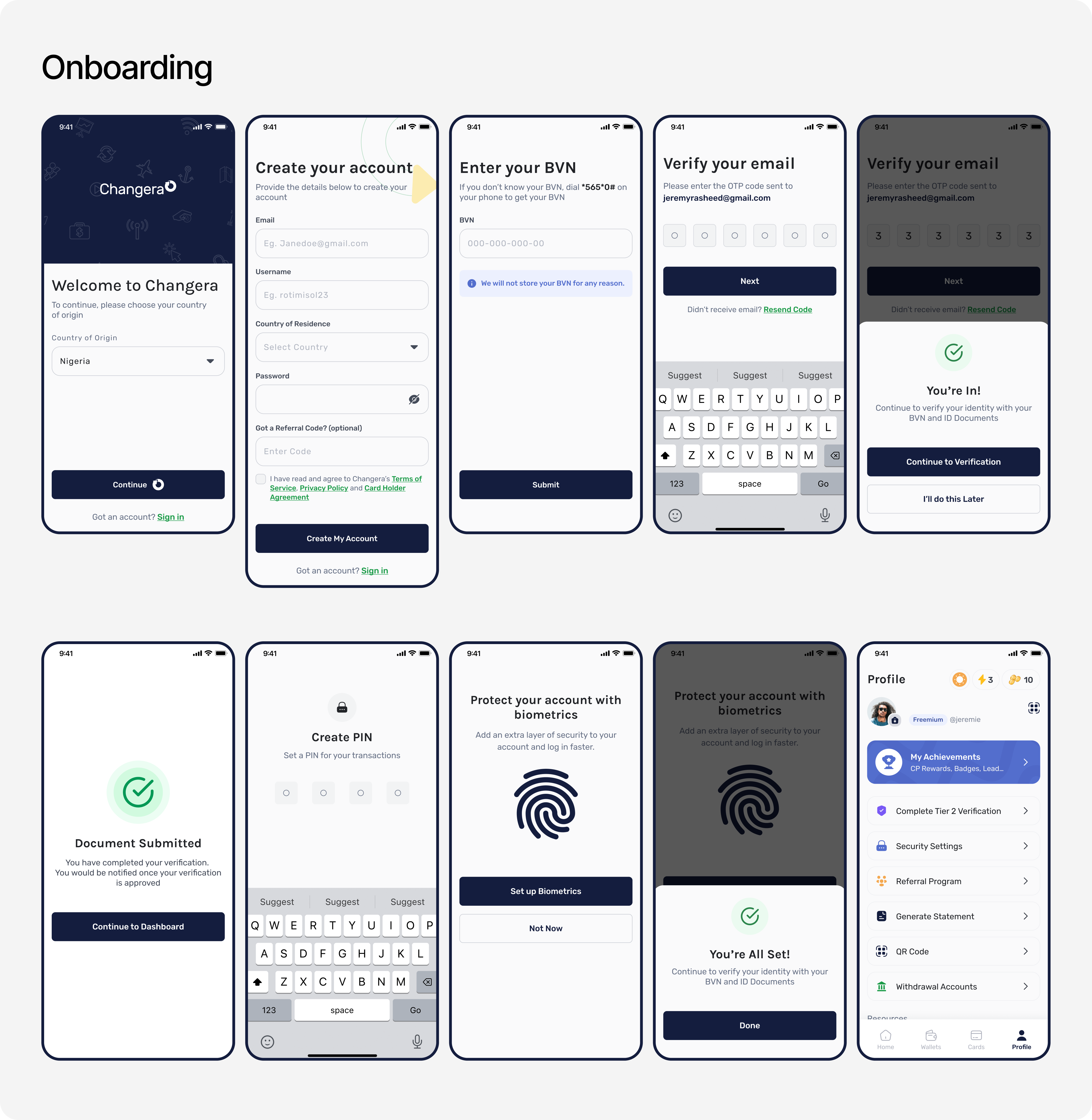
2. Onboarding & KYC Redesign

  • Introduced a tiered KYC flow: allow users to explore with Tier 0 access, and nudge them to upgrade later
  • Created inline validations and real-time document previews

3. Visual & Interaction Design

  • Built a cohesive mobile design system using Figma components and tokens
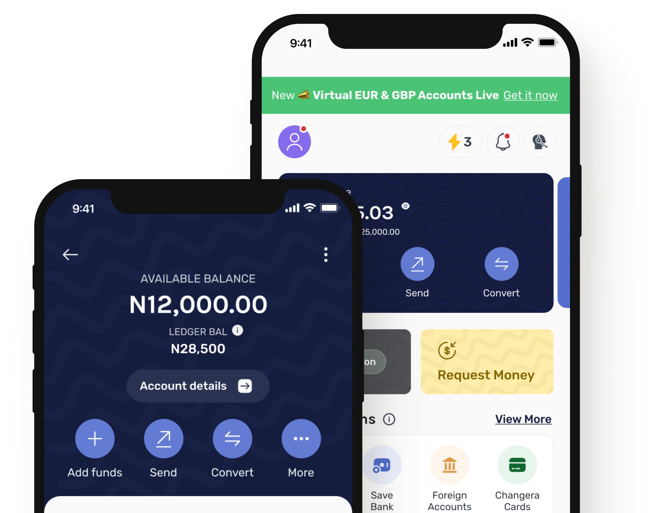
  • Designed wallet cards with smart summaries: currency, balance, recent transactions
  • Integrated loading states, empty states, and transaction feedback to reduce uncertainty

4. Prototyping & Testing

  • Built high-fidelity mobile prototypes
  • Conducted moderated usability testing with 6 target users
  • Key feedback led to simplifying the funding flow and explaining card usage better
  • Key Things I Lead

    • Unified wallet dashboard showing crypto, Naira, USD balances with clear icons and hierarchy
    • KYC verification flow with status indicators and recovery paths
    • Virtual dollar card UX, including funding flow, limit warnings, and spending analytics
    • Dark mode-ready component system for future scalability
    • Push notification and in-app feedback system to keep users informed

    Outcomes & Impact

    • Onboarding completion rate increased by +35% in the first 2 weeks after release
    • Support tickets related to “wallet funding” and “KYC” dropped by 42%
    • Virtual card funding completion increased by +28%
    • App Store rating improved from 2.2 → 3.6 stars in 2 months
    • Delivered a scalable design system used across mobile and upcoming web versions

    What I Learned

    • In fintech, clarity builds trust especially when dealing with money and conversions
    • Design must guide the user through regulatory friction, not avoid it
    • Product success in emerging markets depends on balancing transparency, education, and speed

    Final Thoughts

    Designing for Changera was about more than UI it was about designing confidence. I helped build a financial experience that feels smart, transparent, and empowering for a new generation of global Africans.

    I would love to
    build something
    with you