
CLIQQ is a tool that allows its target market to make connections in a fast paced environment so that they can build long lasting personal and professional networks (clique) that are beneficial.
CLIQQ is a tool that allows its target market to make connections in a fast paced environment so that they can build long lasting personal and professional networks (clique) that are beneficial.
The Client provided my team with a task to imagine a better means of sharing contact details both personal and professional profile of an individual with just a single click.
User experience designer and interaction: Designed the Information Architecture, Userflows, Wireframes, HiFidelity prototypes and Design system.
I followed this process to ensure my design decisions were supported by user research and feedback.


I conducted a heavy discovery phase focusing on user research to identify Users goals, priorities, needs, frustrations, and behaviors related to sharing of contact information. I analyzed the existing market of contact sharing products and noted possible areas of opportunity to better meet user needs, as informed by primary and secondary research.
I delivered a concise UX strategy articulating user beliefs, attitudes, needs, and beliefs for contact sharing. I identified core pain points people currently experience that a new product could address and improve. I articulated a vision for how the new product would improve how and why people want to share contacts information fast and easy.
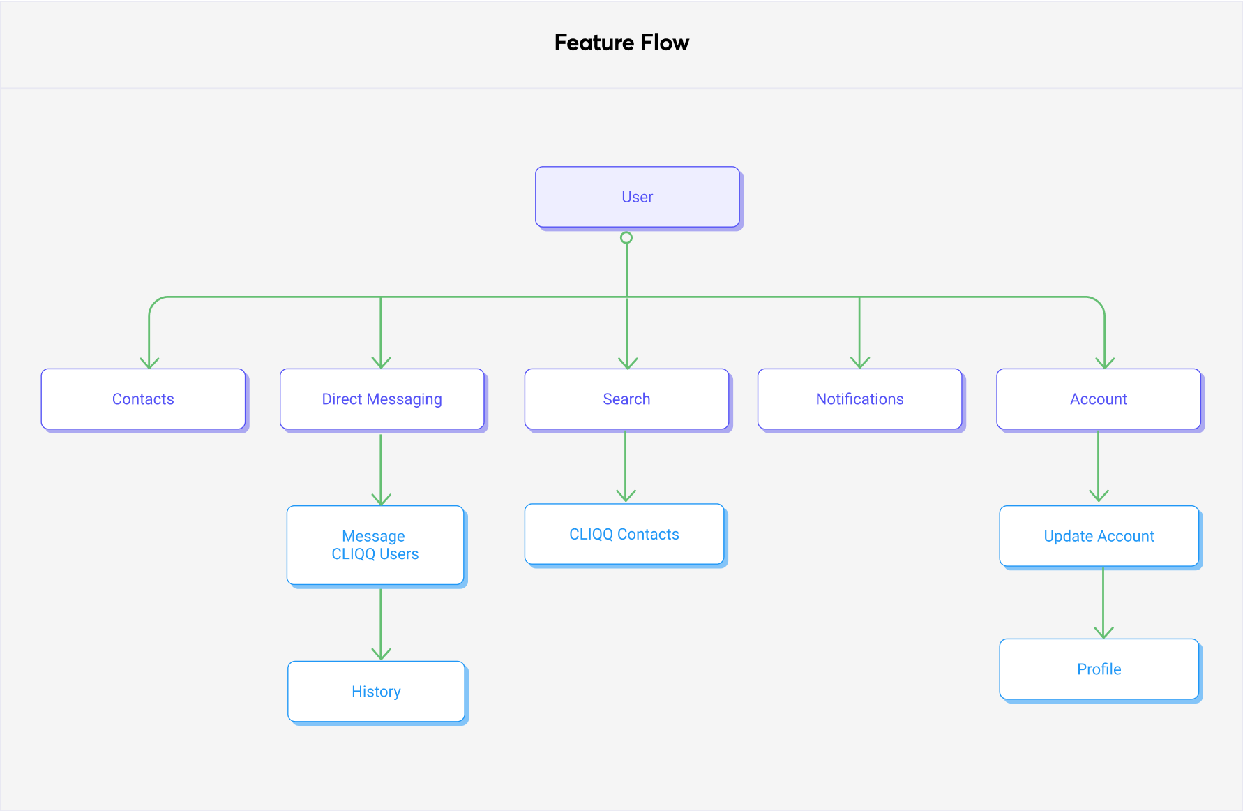
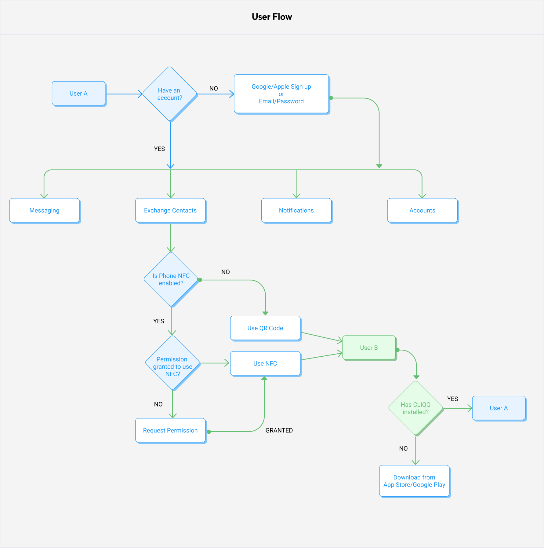
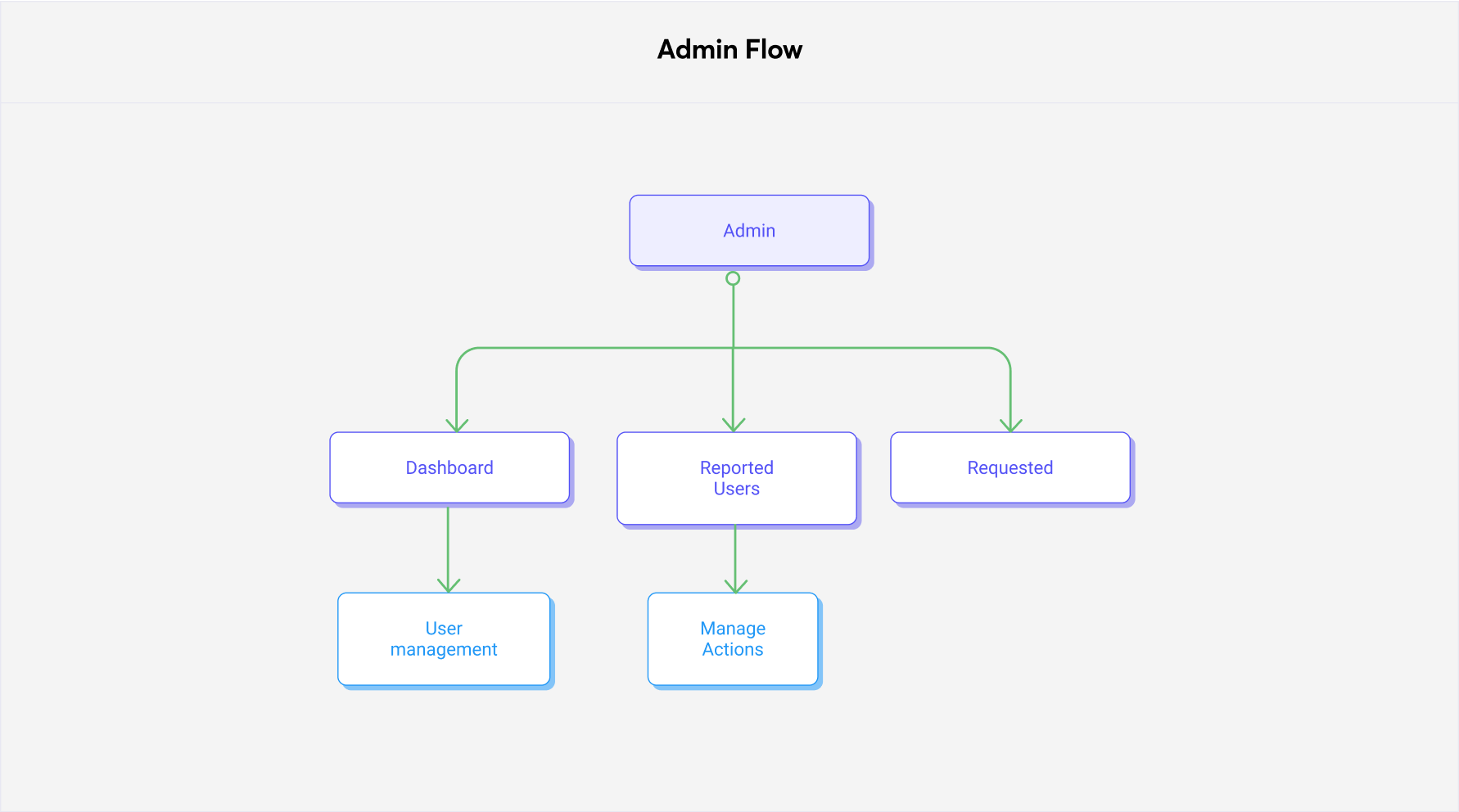
I developed user flows and a clear application map to facilitate multiple user journeys. Focusing on the tracking of sharing contact information and connecting with friends easily.
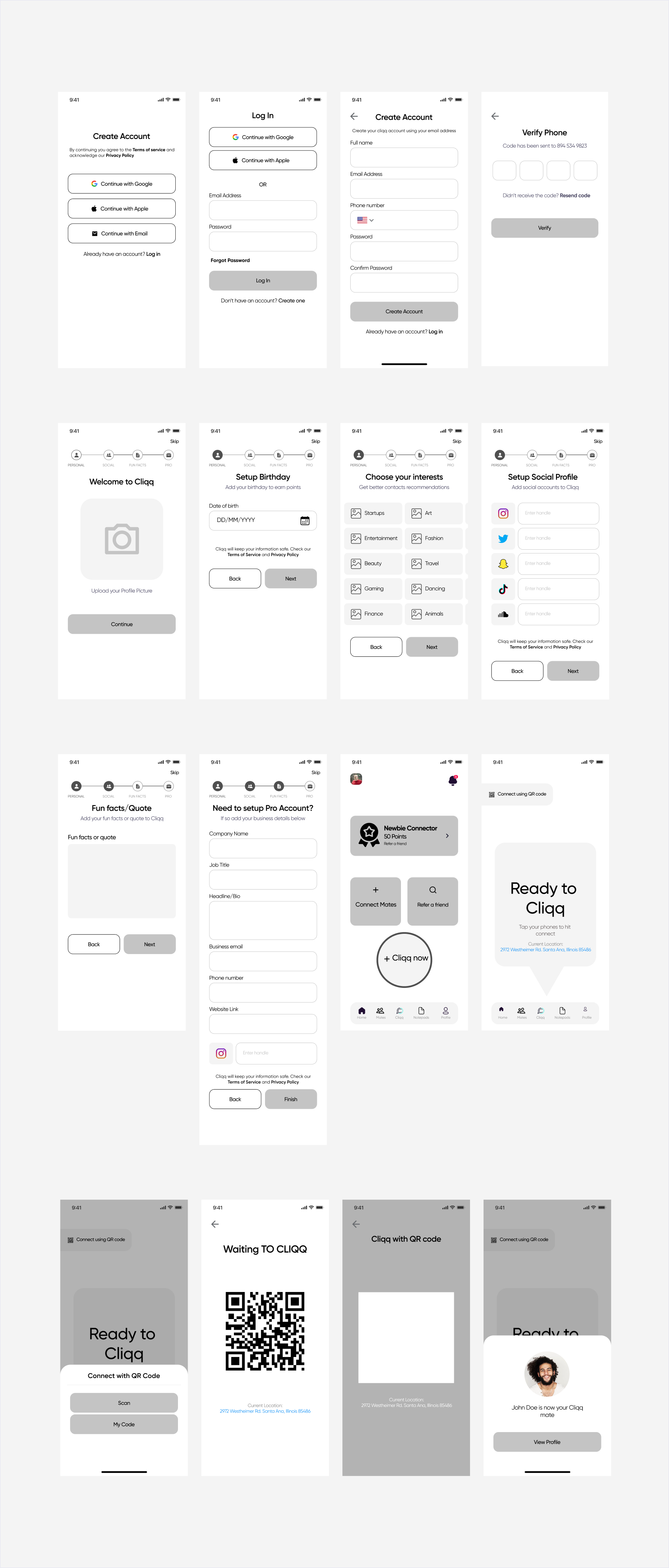
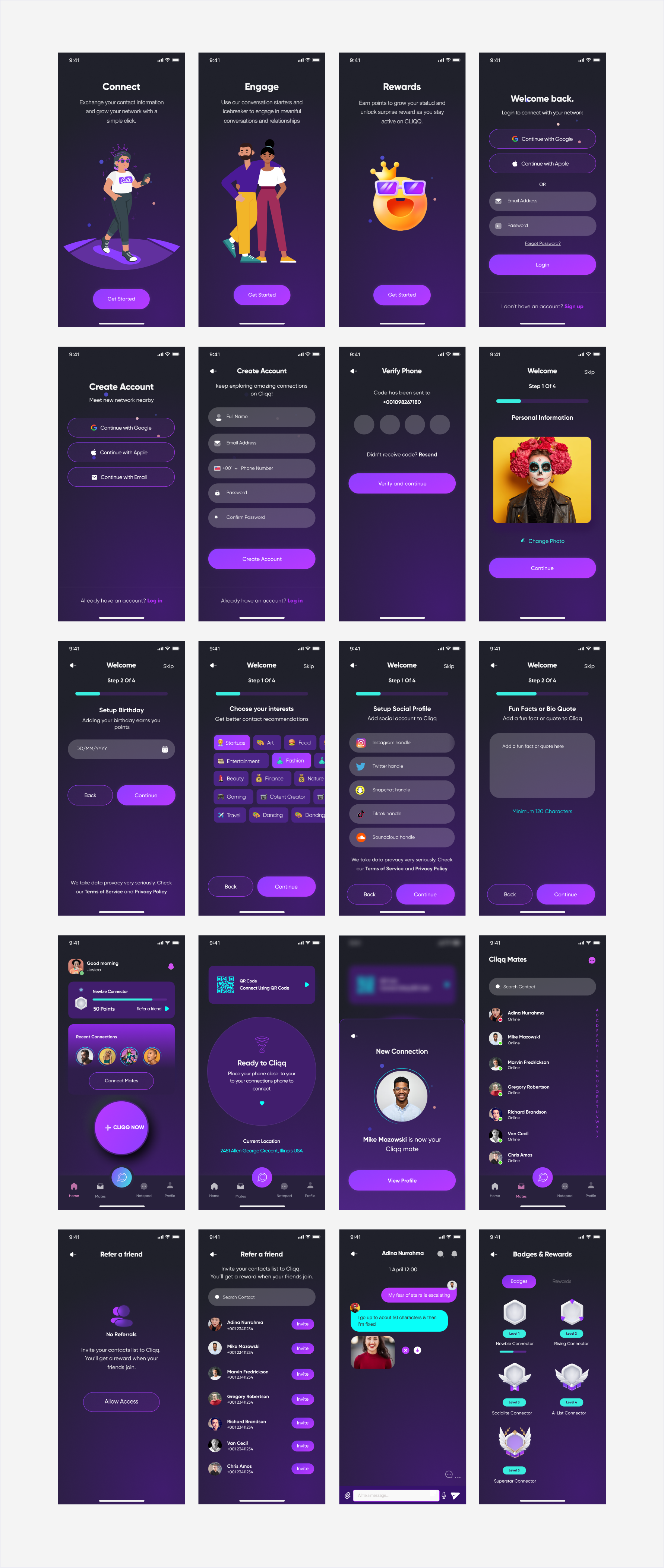
I designed high-fidelity design composites of key screens and a clickable prototype for testing.
I conducted usability testing to gather user feedback on the proposed prototype. I identified sources of user error and frustration, user pain points, and areas of delight. I identified and implemented modifications to the prototype to improve the interaction design of the product.

In order to better understand user needs and behaviors for contact sharing and connecting with friend easily, I designed and conducted surveys and interviews, and recruited Users who had experience in trying to share contacts easily and got frustrated going through a long process.
The surveys and interviews revealed a few core user needs in contact sharing. Overall, Users reported the desire for a product that would not only help them share contacts fast, but to be able to do it with a single click and their personal and professional informationis shared easily.


Quotes from research participants about features of ideal task management tools.
I researched on the contact sharing apps out there and found out those who seem to be offering the same solution my product will be offering. The aim of this is to pull out useful learnings that could help me build an even better product.
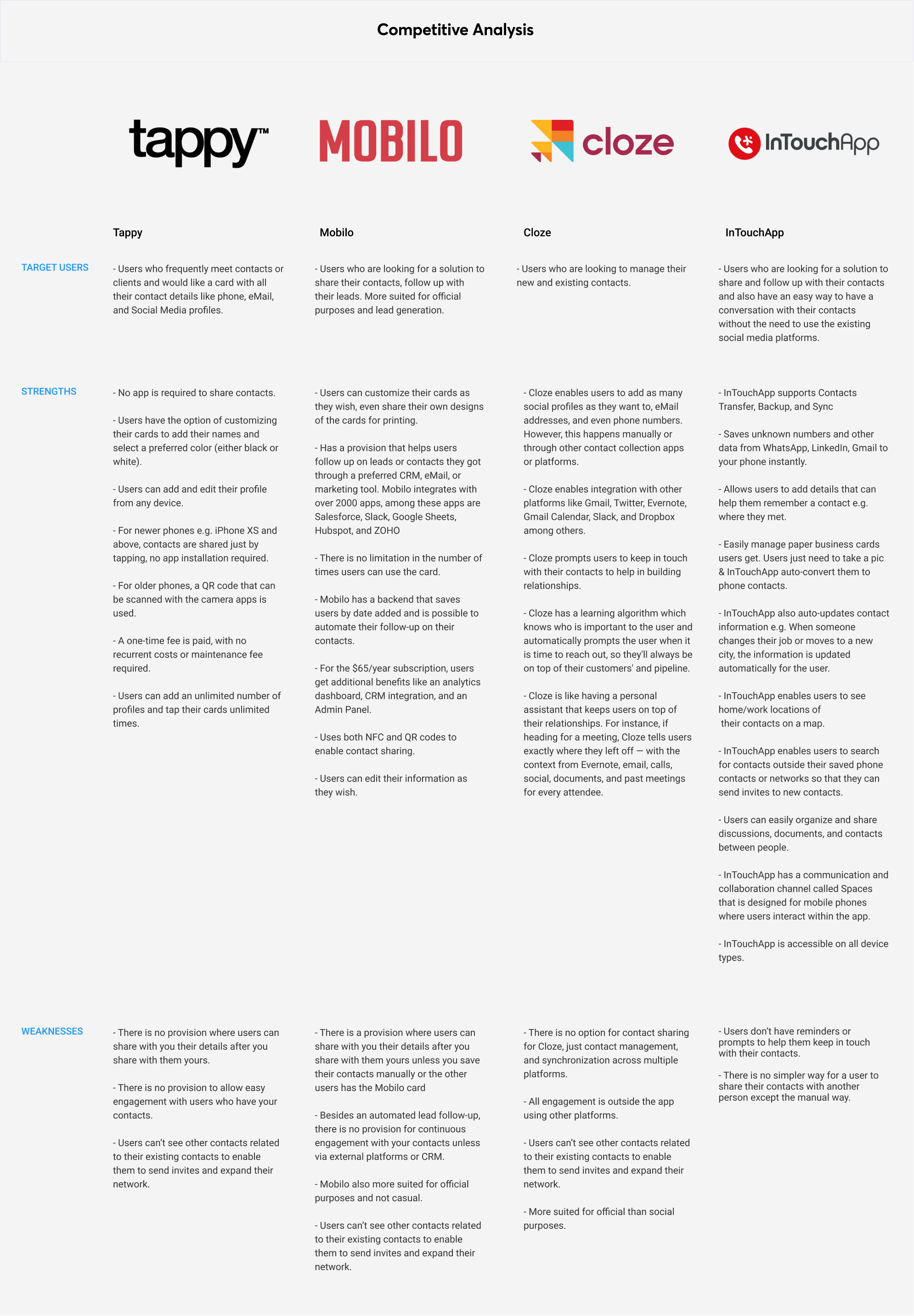
Competitive analysis diagram
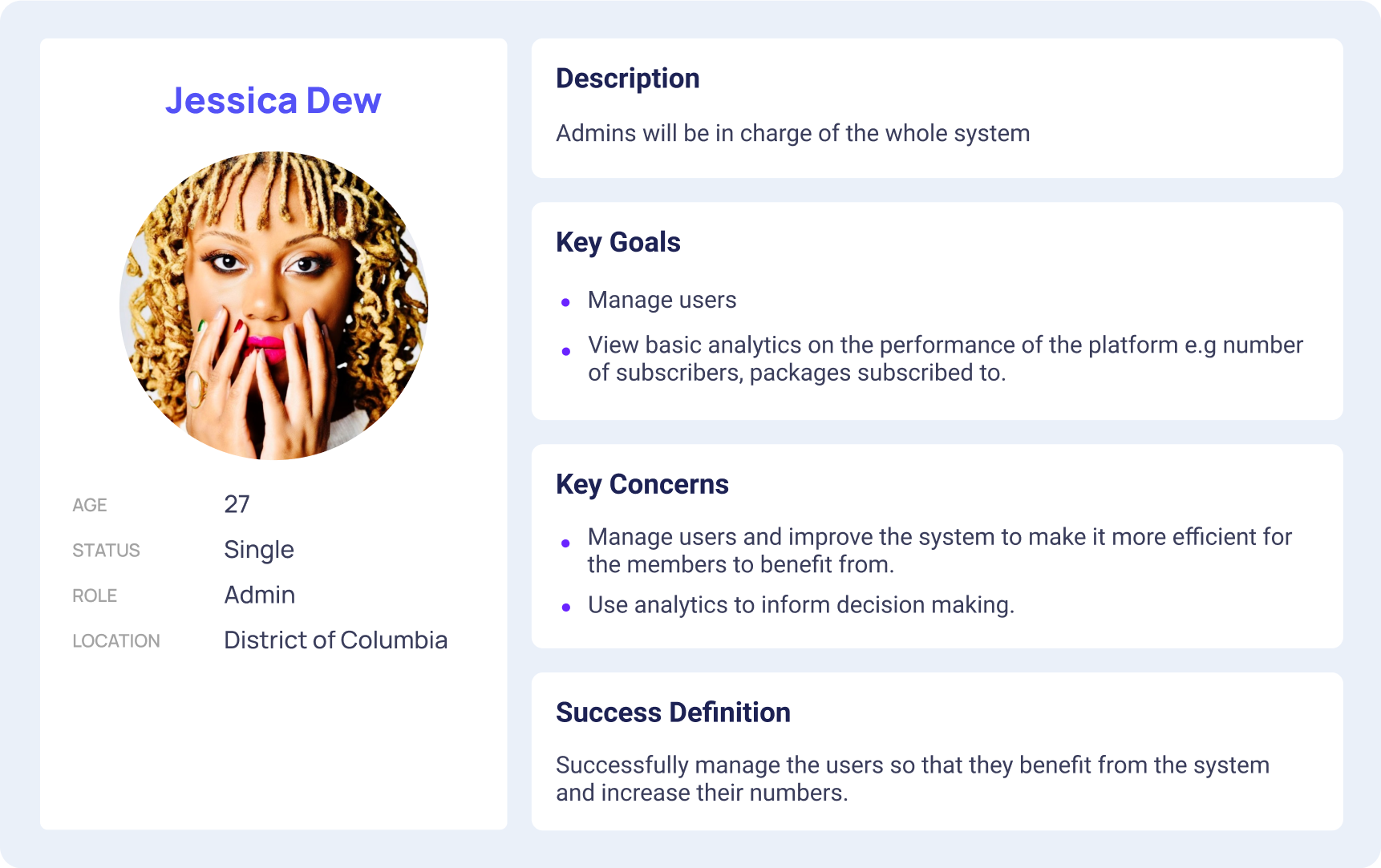
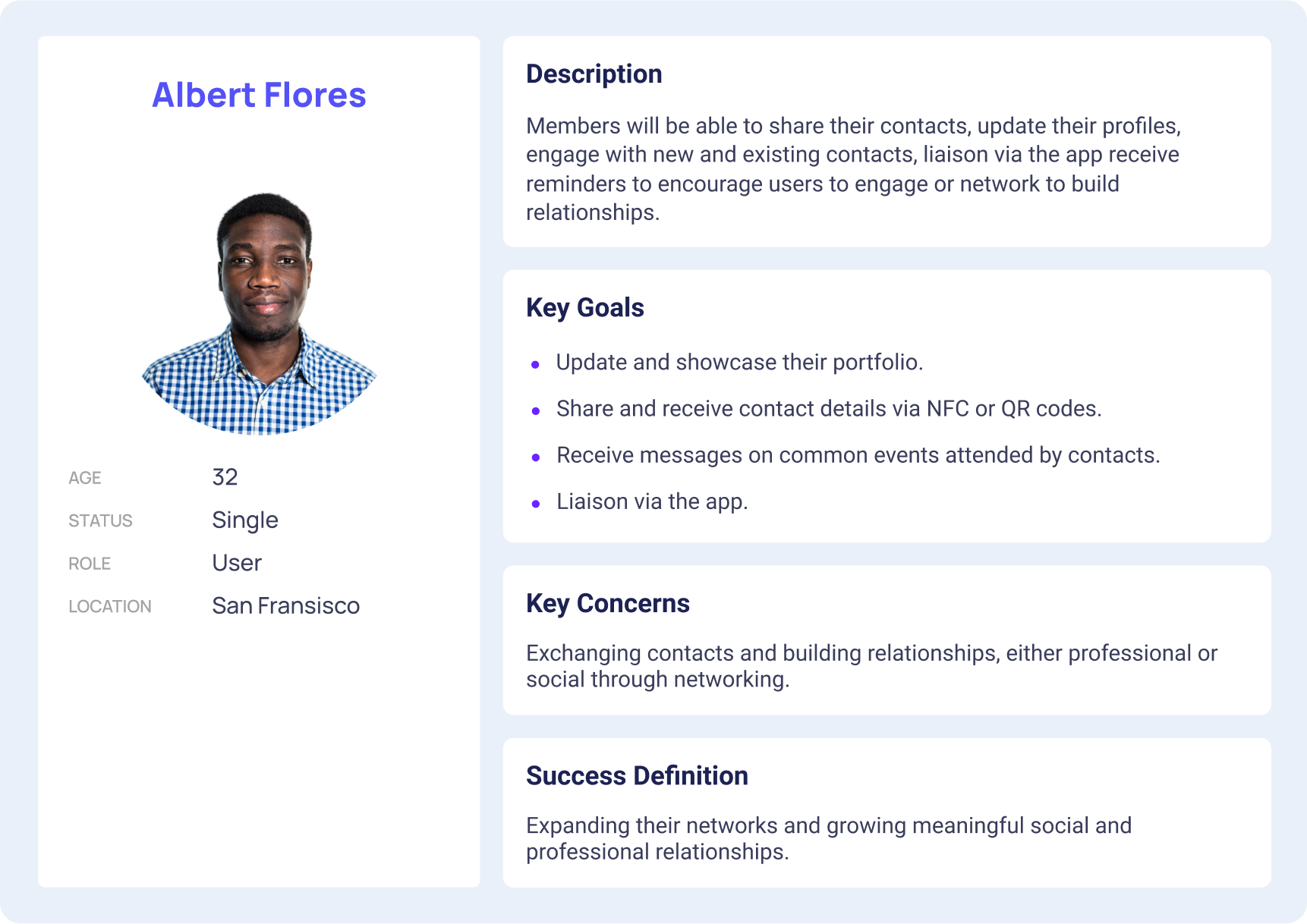
I then set out to create the key persona for this product. The persona helped to highlight some core user priorities: Users want a tool that helps them save time, syncs across devices, helps them share contacts seamlessly, and helps them connect people together.
In order to further hone in on a user’s experience in sharing and managing contacts, I developed a customer journey map. The journey map reiterated the pains, gains, and thoughts featured in empathy maps, and provided a visual representation of the emotions that a person might feel while setting out to accomplish a goal.
Through the process of designing a journey map, I distinguished five overarching phases of a person’s journey towards sharing a contact and managing it: Defining it, Planning it, Delegating the contact, Reflecting on the execution, and Completing the task. Developing a journey map was particularly crucial for identifying the pain points someone might feel — and the emotional “roadblocks” or “barriers” that one might face — in the process of accomplishing sharing contacts and managing them.
Informed by both the primary and secondary research findings, I drafted an application map to organize content and features. I considered the priorities that research participants indicated as important — such as creating tasks and managing teams, having a calendar, and having reminders — and mapped how they might relate to one another within the information architecture of the product.
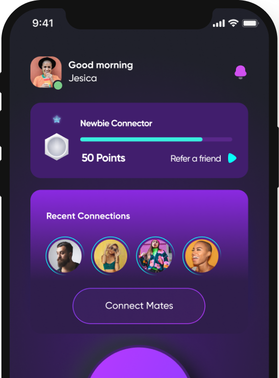
The application map informed the key screens that I developed the low-fidelity wireframes. These became the basis of the prototypes I used for the first round of usability testing. Based on the application map I had designed earlier, the prototype included the key screens needed to allow people to sign up for the first time, setup their profiles, and share contact information.
We conducted live and remote usability testing with people within the target audiences. As we moved into usability testing, we wanted to know the following:
After several rounds of usability testing and iteration, we designed the high-fidelity screens.
This project helped me understand that good products are built with human-centered thinking and is amplified when created in collaboration with people of diverse backgrounds.
I significantly saw that design systems, design principles, unified tech databases, and many more centralised systems helped in steering the ship in one unified direction.
Send an email
buharijemilu@gmail.com
© buhari-jemilu, All rights reserved
